Canopy Cloud Storage
Canopy is a cloud storage application that emphasizes organization and collaboration for a seamless working experience.
Design Roles
- UX Design
- Visual Design
- Branding & Identity
Deliverables
- User Surveys
- Personas
- Competitive Analysis
- Concept & Brand Identity
- User Stories
- User Flows
- Wireframes
- User Testing
Specifications
- Tools & Software
- Figma
- Adobe Illustrator
- UsabilityHub
- Duration: 2 months
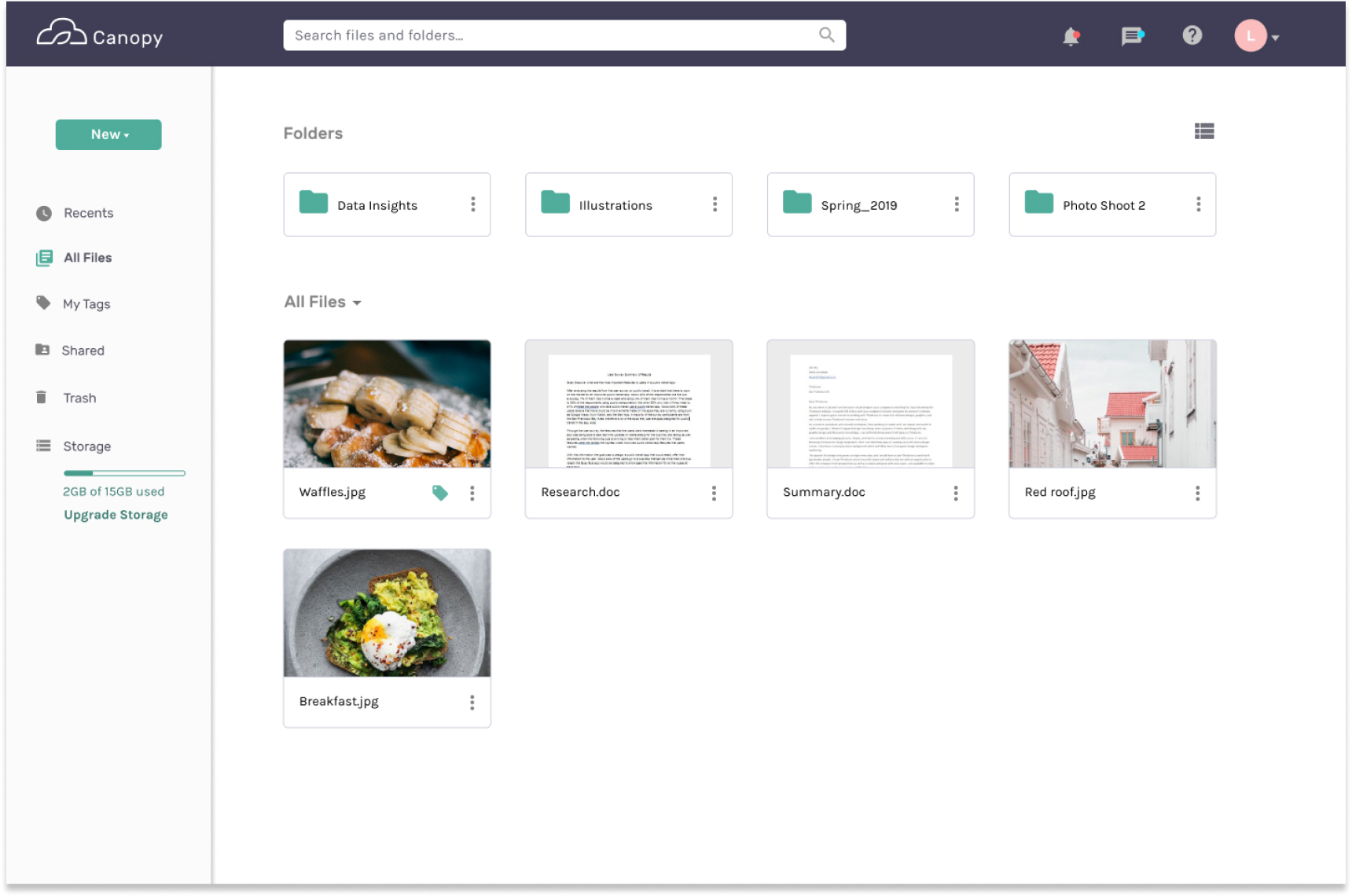
Problem: Cluttered Dashboards
From working professionals to small business owners, to students, these users may upload and share a variety of content on a daily basis. These items can be overwhelmingly disorganized on a busy dashboard. Although there are various cloud storage products on the market, there is yet to be one that emphasizes organization and collaboration.
Solution: Organization For A Better Workspace
Canopy aims to declutter dashboards and ease workflows through emphasizing organization and collaboration. Canopy offers the following features:
1)Tagging feature to help organize content
2)Real time collaboration across all documents
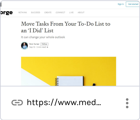
3)Ability to save web links for future reference
Who Are the Cloud Storage Competitors?
01 Research and Define
In order to better understand the competition and the client's required features for this product, I did a competitive analysis of three major cloud storage platforms: Google Drive, Dropbox, and Box. Each cloud storage product has their own strengths and weaknesses.
Great for content creation and collaboration
Lacks organization system
Dropbox
Easily upload content from desktop/mobile
Lacks organization, and depends on Google for content creation
Box

Geared towards businesses and enterprise
Lacks organization, and depends on Google for content creation
These are some of the cloud storage platforms that are well established, and they have a great set of features that keep users satisfied. However improvements can be made in regards to organization and collaboration. This allows a newcomer to enter into the market. As a newcomer, Canopy can position itself as a cloud storage application that emphasizes organization and collaboration, with all the useful features of its top competitors.
How Are People Using Cloud Storage?
To better define a target market, I conducted a user survey to find out more about what people are using cloud storage for and how they are using it.
96%
of respondents use cloud storage for personal use
83%
of the respondents use cloud storage for personal and work use
42%
of the respondents use cloud storage for personal, work, and school use.
Top 3 Reasons For Cloud Storage Use
The survey results indicate that a majority of users use cloud storage for more than one purpose. The top 3 uses for cloud storage are for team collaboration, to share content, and to create and edit content. These results will act as a guide to design a cloud storage product that facilitates collaboration with strong organization features for a well managed workflow.
Top 3 Uses For Cloud Storage Applications
Collaboration with a team
Create and edit content

Back up content and share it
Below is a list of features requested by the client for this cloud storage application. Some features are already present in current cloud storage apps. Users were asked to rank the features from "very useful" to "somewhat useful" or "not useful". The new product will have all the basic features of a traditional cloud storage app with an added emphasis on organization and collaboration. This will help determine what features to include in the design moving forward.
Features In Current Cloud Storage Apps
- Creating content
- Sharing files and folders
- Editing files in the cloud
- Simultaneous collaboration on files in the cloud
- Ability to upload content from a desktop or mobile device
New Features Requested By The Client
- Organizing content using tags or categories
- Ability to save weblinks
Features In Current Cloud Storage Apps
The two new cloud storage features that will be included in the design of the product are: the ability to organize content using tags/categories, and the ability to save weblinks. Users rated these features to be "very useful and somewhat useful." With the client's requested features being validated by the user survey, these features will be included in the MVP.
Identifying the Users
02 Strategy
Based on the user research results, two personas were created to help further identify the direction of this new cloud storage product.
David, 35 years old - Director of Corporate Facilities

"I have so many projects going on and creating so many folders just clutters up my dashboard too much. I just want a more organized workspace."
Goals
- Upload and share invoices within teams and across teams
- Organize invoices in specific groups/categories per project
- Update project milestones and allow different teams to access project timeline
- Would like to find folders by searching specific keywords
Frustrations
- Invoices can get lost in the cloud due to limited organizing/tagging features in current cloud storage devices
- Many people are asking for the same information regarding different projects, so there should be a central file everyone can have access to
- Cloud storage dashboard has many files and looks disorganized
Natalie, 23 years old - Design Student and Blogger

"I am currently taking so many classes! Being able to back up and access group projects or inspiration articles at all times is a must."
Goals
- Save articles and inspiration images in one place
- Back up and organize pictures from the digital camera and smartphone
- Scan and organize sketches for school projects
- Organize school work files and personal blog files in separate categories
Frustrations
- Not enough storage space
- Saved weblinks gets lost in the bookmarks section of the web browser and there is no "on-the-go" access
- Group projects can be difficult to collaborate on
- Hard to keep track of changes for a file
User Stories
Before the design started it was important to create user stories and highlight the important tasks to create a prodcut that would be viable. A list of user stories were created with the high priorty tasks being the main focus for the first iteration.
High Priority Tasks For A New User
- Sign up for an account using my email, Google account, or Facebook Account
- Upload a file from a computer or mobile device
- Share a folder or group of items with someone and vice-versa
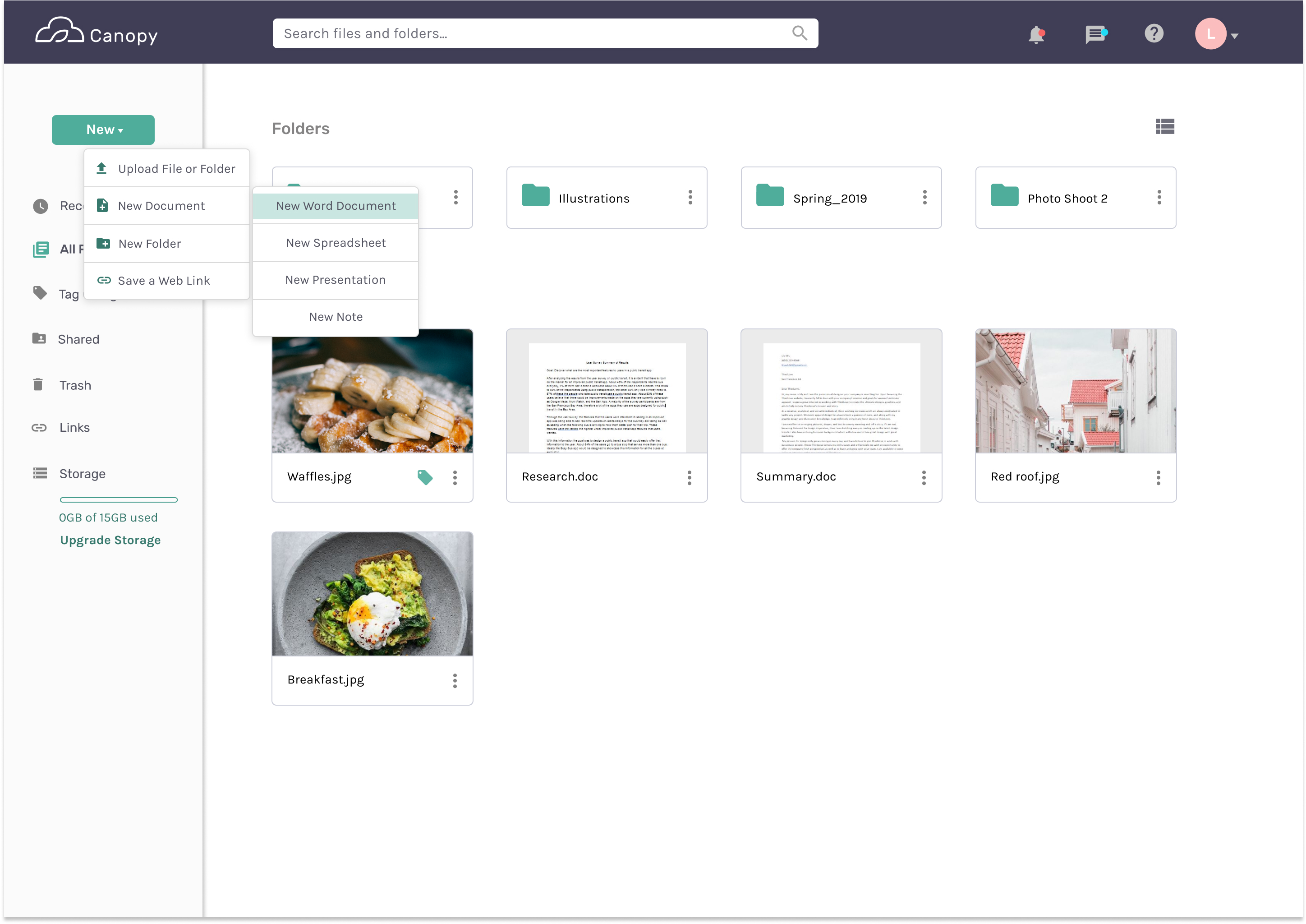
- Create content: a new document, spreadsheet, presentation
- Collaborate with others in real time on a file
- Share a single item with someone and vice-versa
I also included user stories from the perspective of returning users and admin users. They can be viewed in full detail in the link below.
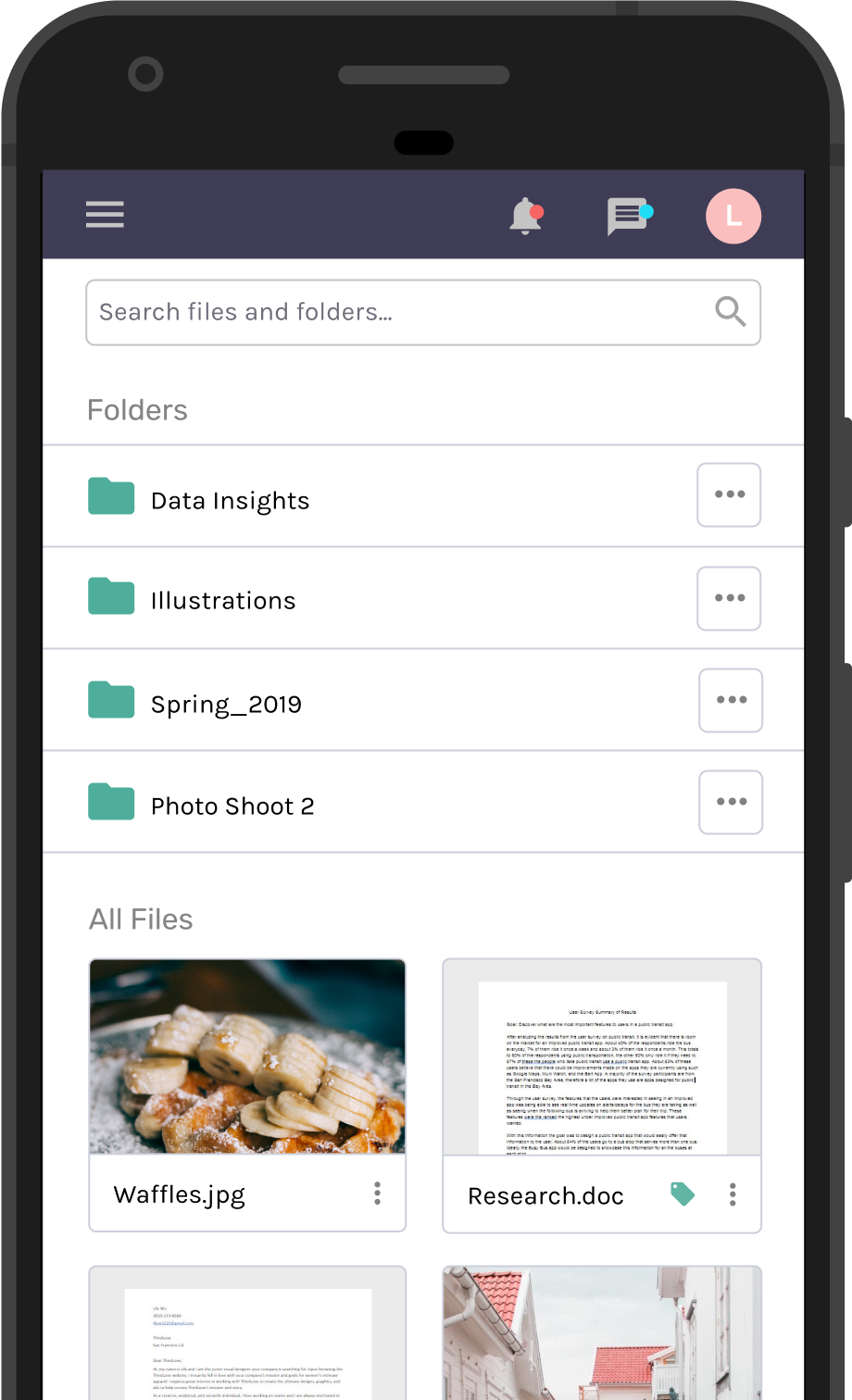
Structuring the Cloud Storage Flows
03 Information Architecture
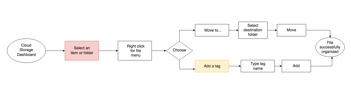
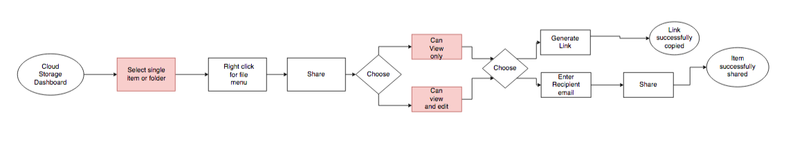
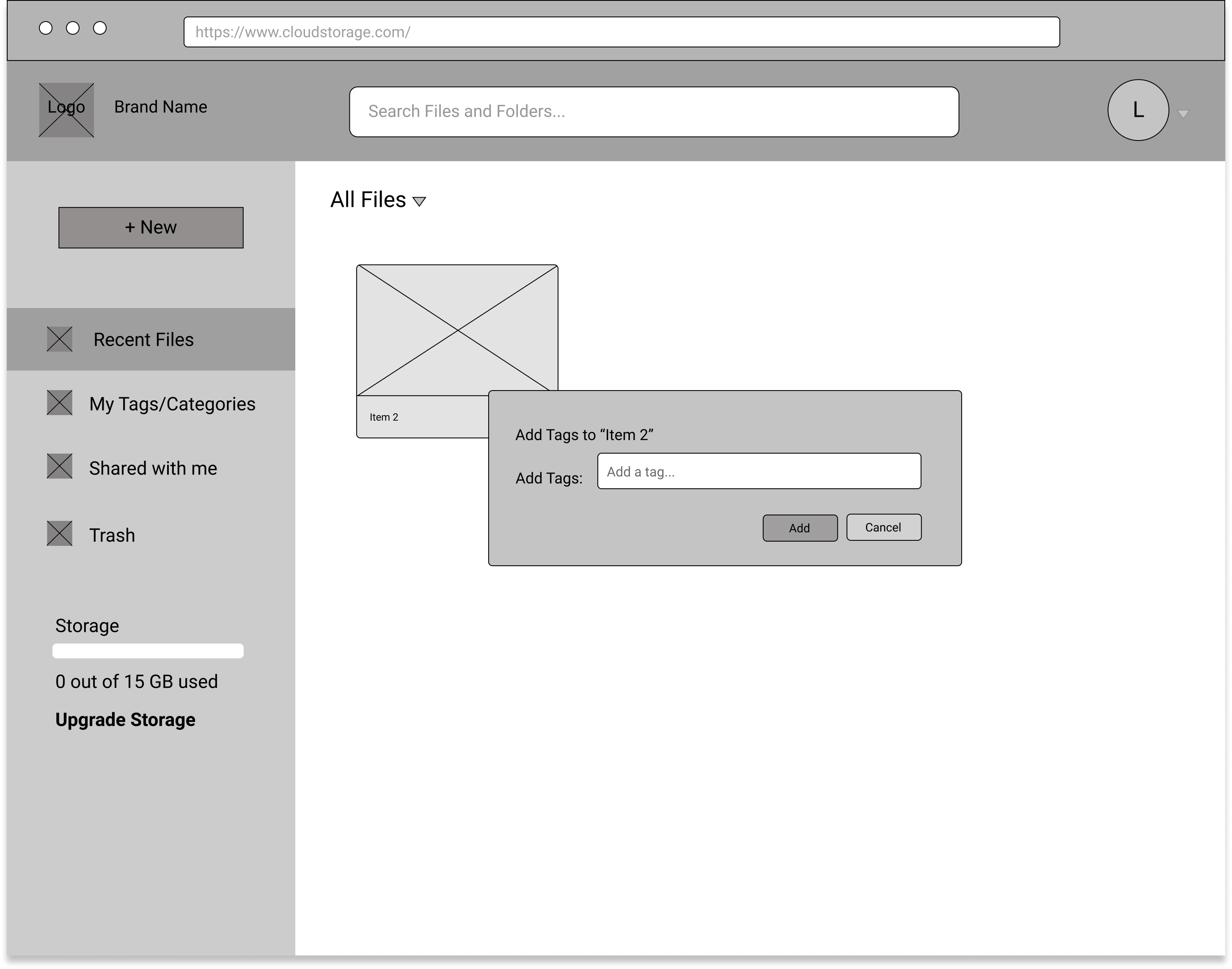
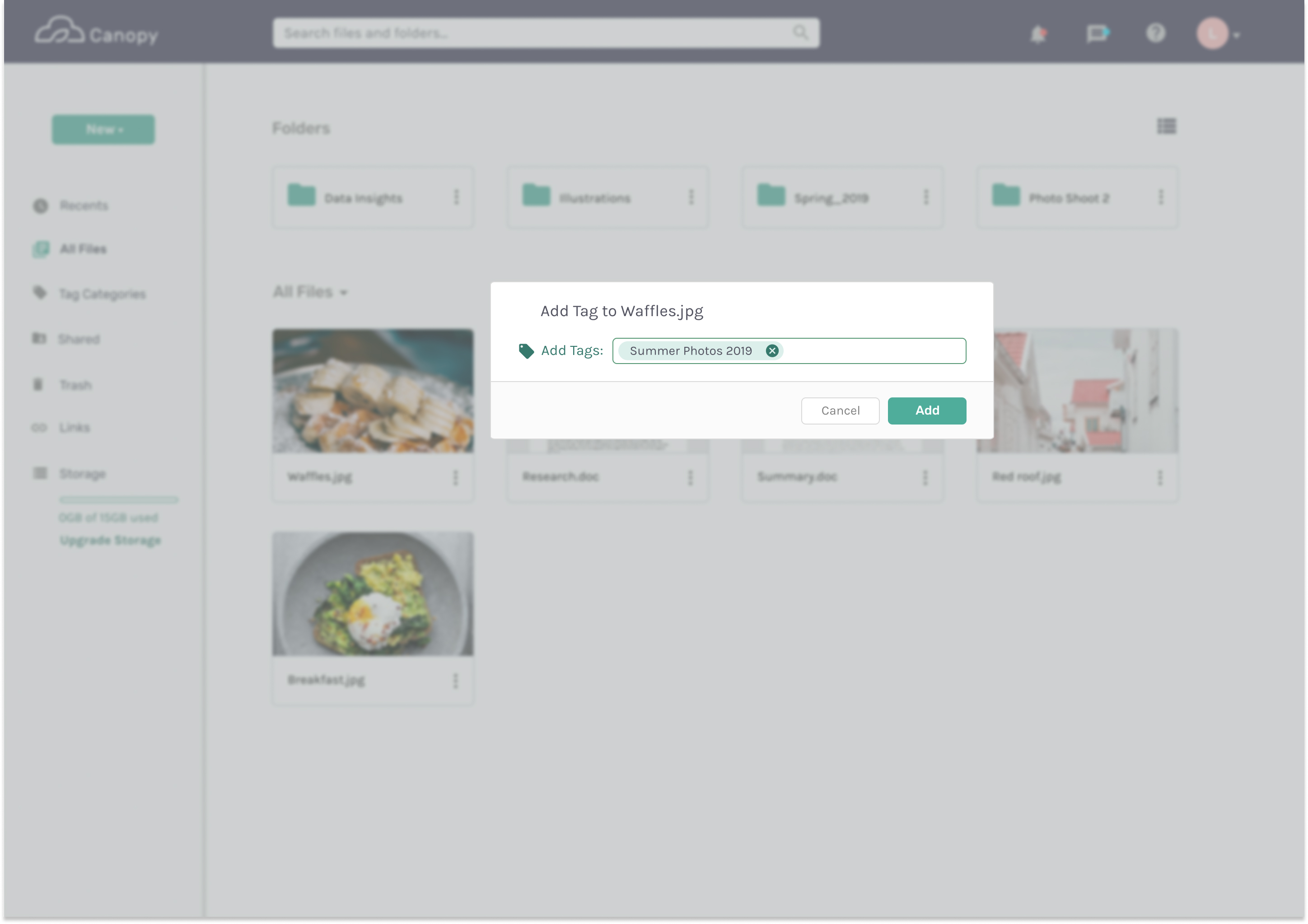
From the user stories, I mapped out user flows to include high and medium priority tasks. The two user flows shown here are about organization and collaboration which is aimed at helping users create a more efficient workflow.
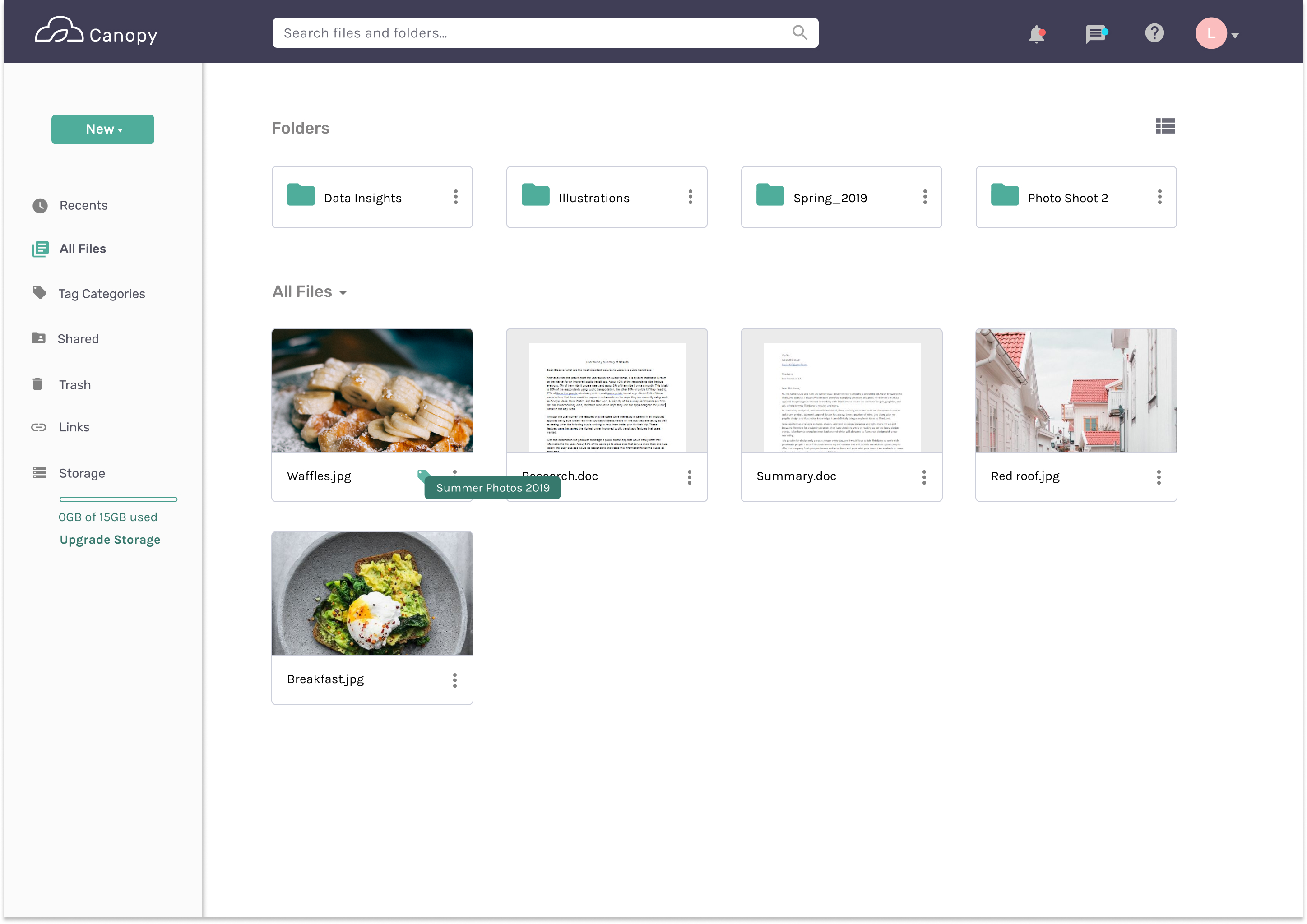
One flow highlighted here is adding a tag to a file or folder for additional organization. Competitiors such as Google Drive, Dropbox, and Box do not offer such organization features. On the competitors platforms, users are only able to see their files under “Files” or “Recents.” With Canopy, users will be able to create their own categories under “My Tags” so they can futher organize the content they upload or create.
Canopy Organization Flow
Canopy Collaboration Flow
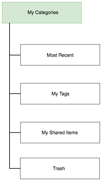
Site Map
From the user flows, I created a sitemap to showcase the overall components of this new cloud storage product. This portion of the sitemap shows what the dashboard's organization structure will display. The sitemap can be viewed in detail from the link below.
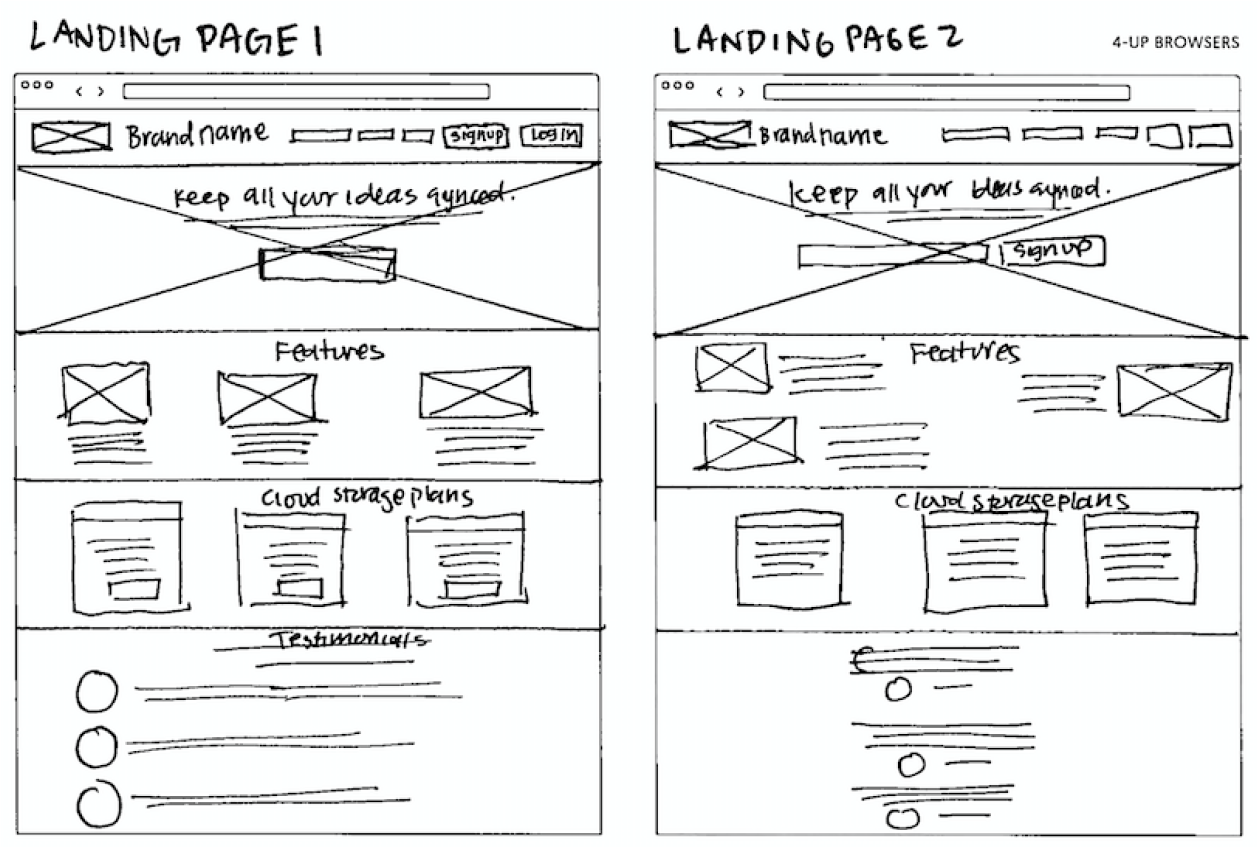
Sketches
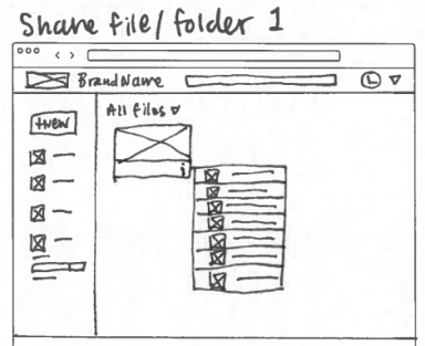
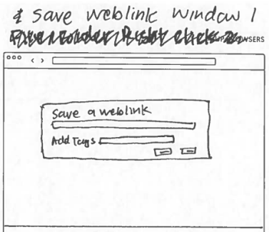
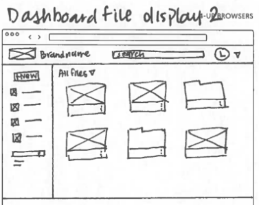
After figuring out the user flows, the next step was to create wireframes that would reflect how users will interfact with the product. Below are some examples of some sketches with different iterations. The main goal here was to create a series of solutions that would promote organization and collaboration for the users.
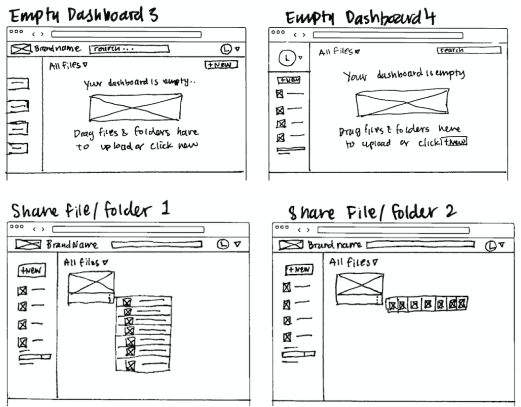
Wireframes(Low Fidelity)
Following the sketches, I created wireframes that would be a foundation from where the design will grow. Here are some of the wireframes shown below.
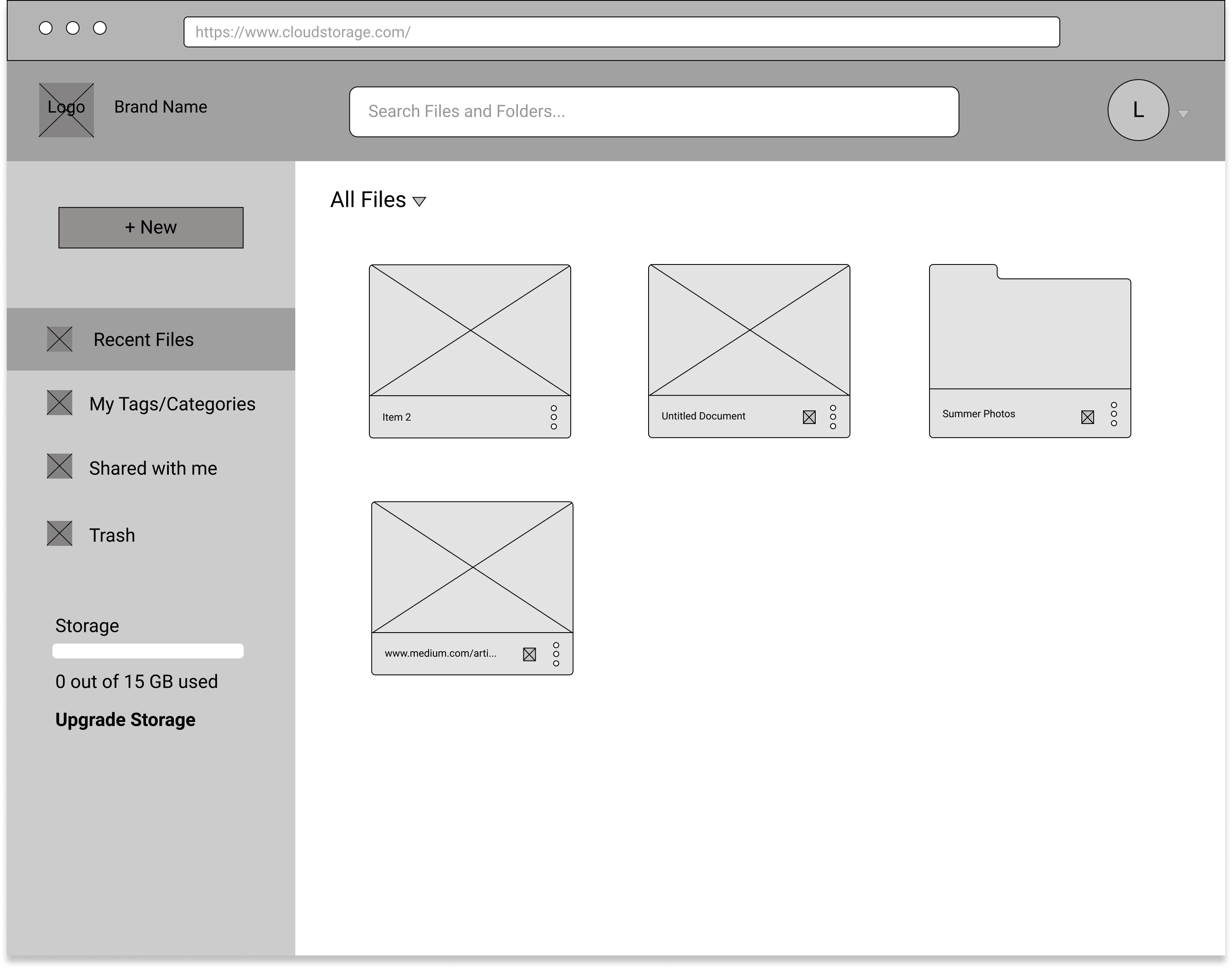
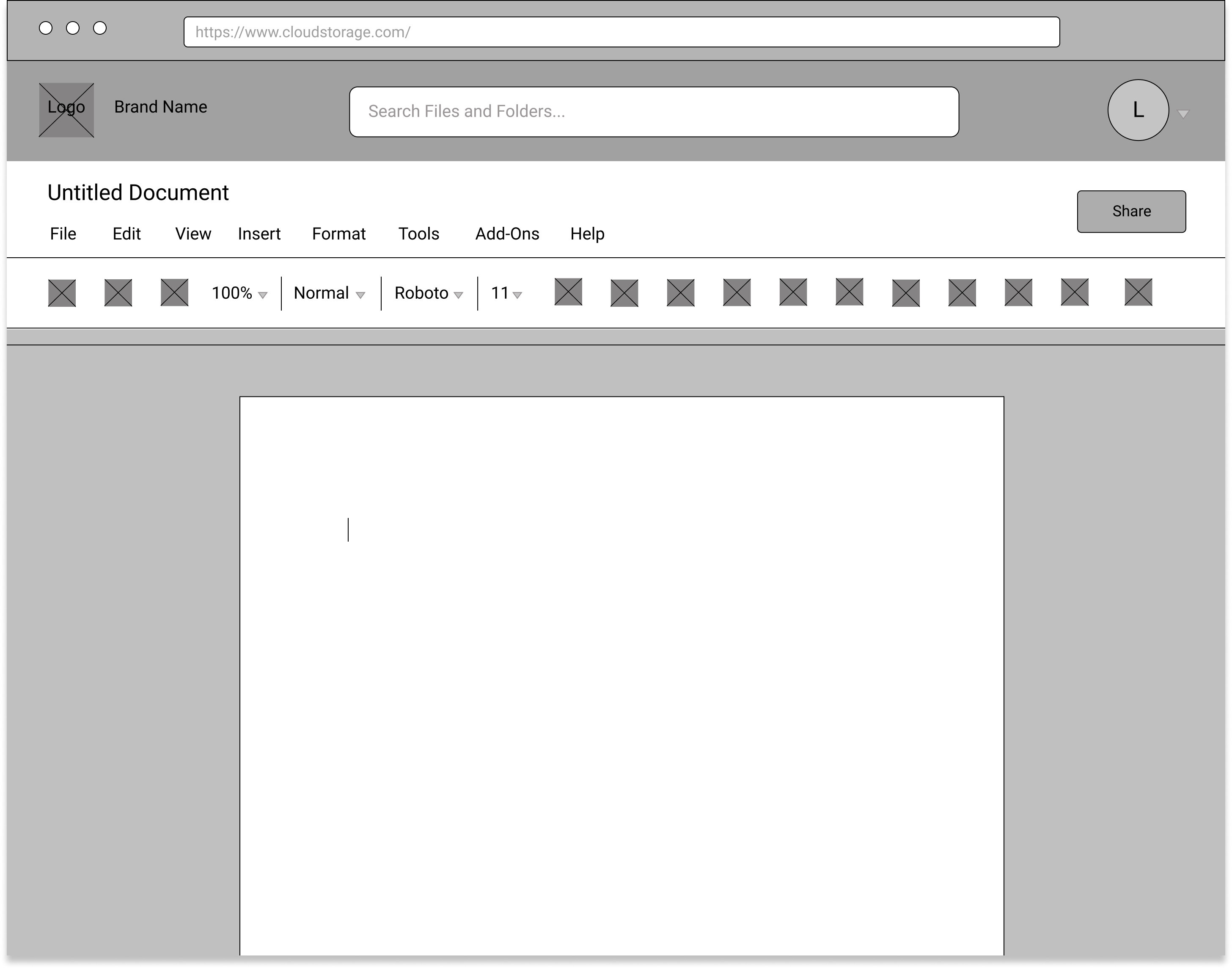
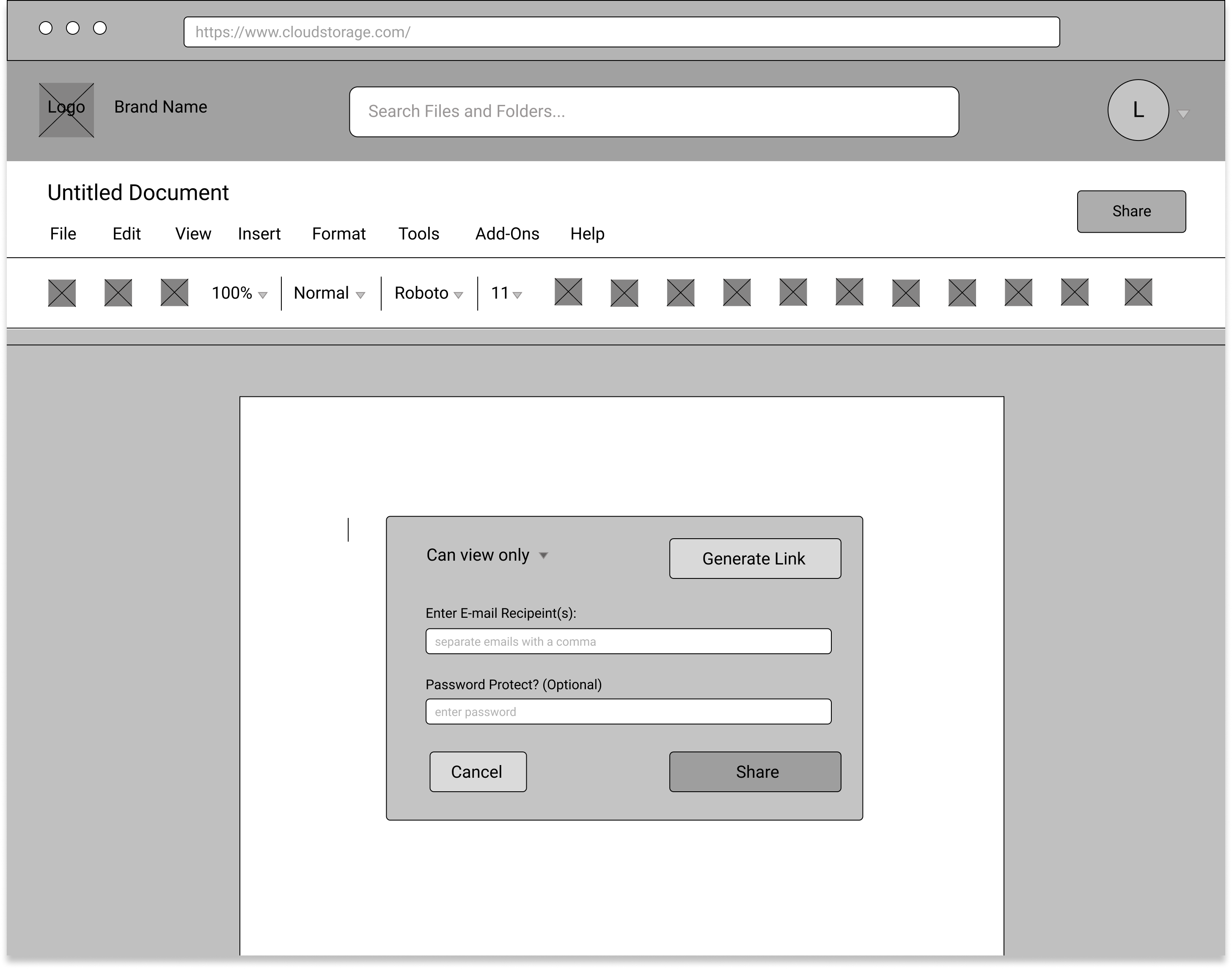
From these wireframes I developed a low fidelity prototype which will be used for usability testing round one.
User Testing Round 1
From these wireframes I developed a low fidelity prototype which was used for the first round of usability testing. It is important to perform usability tests early on in order to identify any issues that users may face.
Users tests were conducted in person and also through remote testing.Users were asked to complete the following tasks:
1) Sign up for a basic account
2) Upload file(s)
3) Add a tag to a file to organize it
Based on the user testing results, the following changes were made.
Change made: Removed "Share with Friends and Family" screen.
Users were confused by the share with friends a family screen and its purpose. It posted as a barrier to entry so it was removed. New users now go straight to the dashboard after sign up.
Before
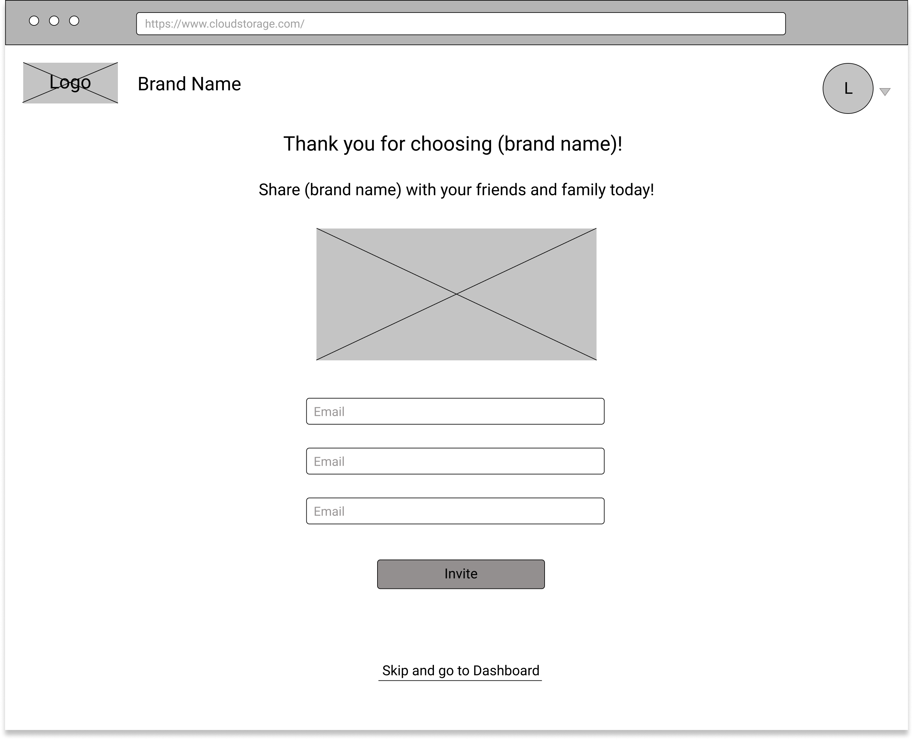
After
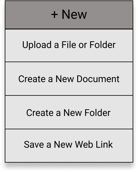
Change made: Combined "Upload a File" and "Upload a Folder" option from the drop-down menu.
Users were confused by what was the difference between these two selections when instruucted to upload an “item.” Upload a file and upload a folder essentially opens the same window from the computer. Therefore, these two selections were combined to declutter the dropdown and lessen any confusion.
Before
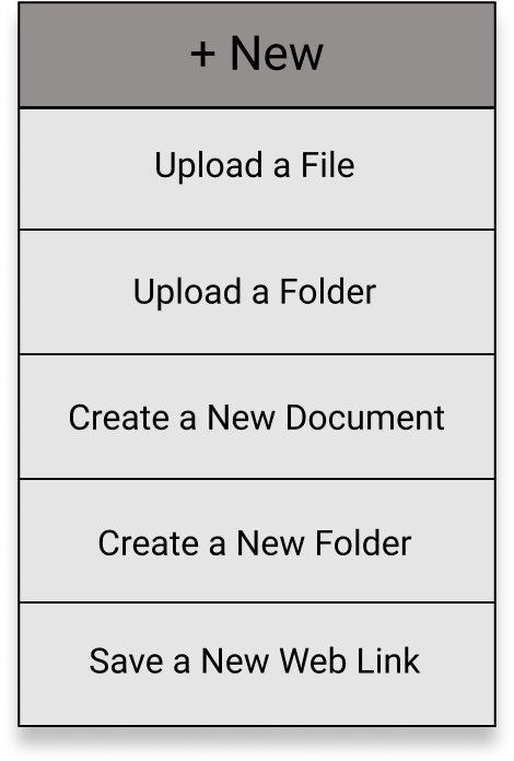
After
Users were able to complete the mentioned tasks in the user test in a fairly straightforward manner. Issues that arose during the testing were addressed in the changes. This can help guide the design in the right direction.
04 Branding & Identity
Brand Story and Name
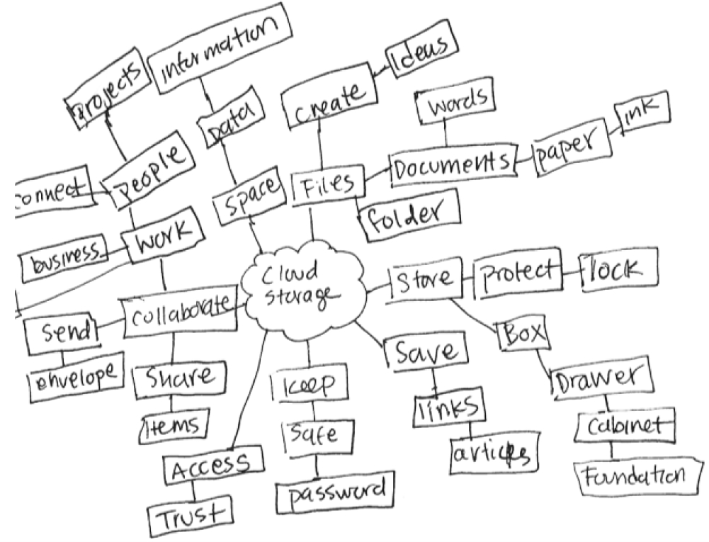
The name “Canopy” is inpsired by the rainforest canopy. Within the rainforest canopy, there are various forms of life. It is vibrant, green, full of leaves and continuously growing. Similarly that is the story for this cloud storage app. The “leaves” in the canopy represent the files, documents, images, and links that are stored in the cloud. Within the rainforest canopy there are many things going on, such as animals and plants coming together to create a whole ecosystem. Similarly on this cloud storage application, people will share documents and files and come together to collaborate on projects.
Canopy Principles

Secure

Reliable

Intuitive
Color Palette & Typograhy
The color palette chosen is defined to communicate trust, reliability, and a seamless workflow. Colors chosen are accessible, calm, and natural to reflect the Canopy name and feel.
Primary Brand Colors for Canopy

Tradewind
HEX # 4EAD9B
RGB 78/ 173/ 155

Cape Cod
HEX # 353636
RGB 53/ 54/ 54

Blue Zodiac
HEX # 3F3D56
RGB 63/ 61/ 86

White
HEX # FFFFFF
RGB 255/ 255/ 255
For the typography, I chose Rubik to pair with the logo, and Karla as the complimentary. Both of these are sans-serif typefaces that have curves in the letterforms that pair well together. They give the brand a simple and modern aesthetic.
Large heading. Rubik Medium set to 32/44.
Body text Karla Regular set to 16/24. The purpose of this text is to allow you to see how the sizing and spacing appears on the page following the size and spacing guidelines established.
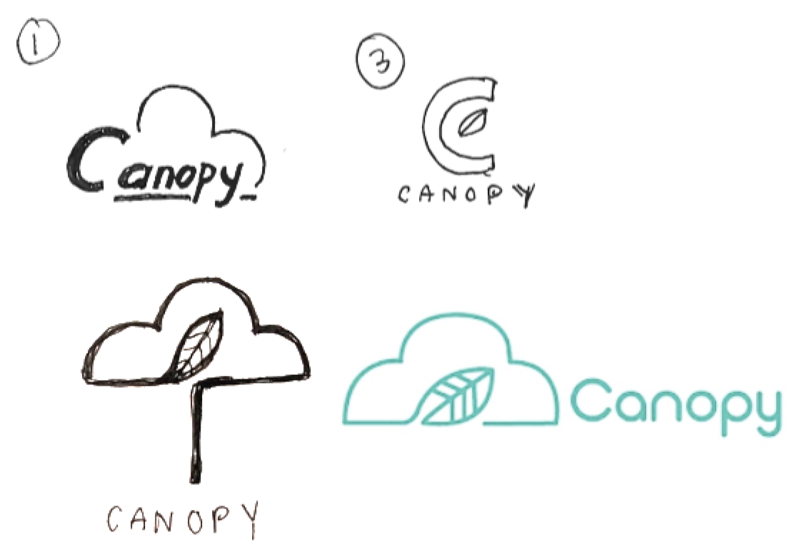
Logo Development
The color palette chosen is defined to communicate trust, reliability, and a seamless workflow. Colors chosen are accessible, calm, and natural to reflect the Canopy name and feel.
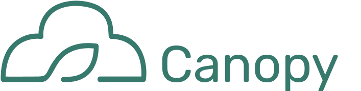
Final Logo
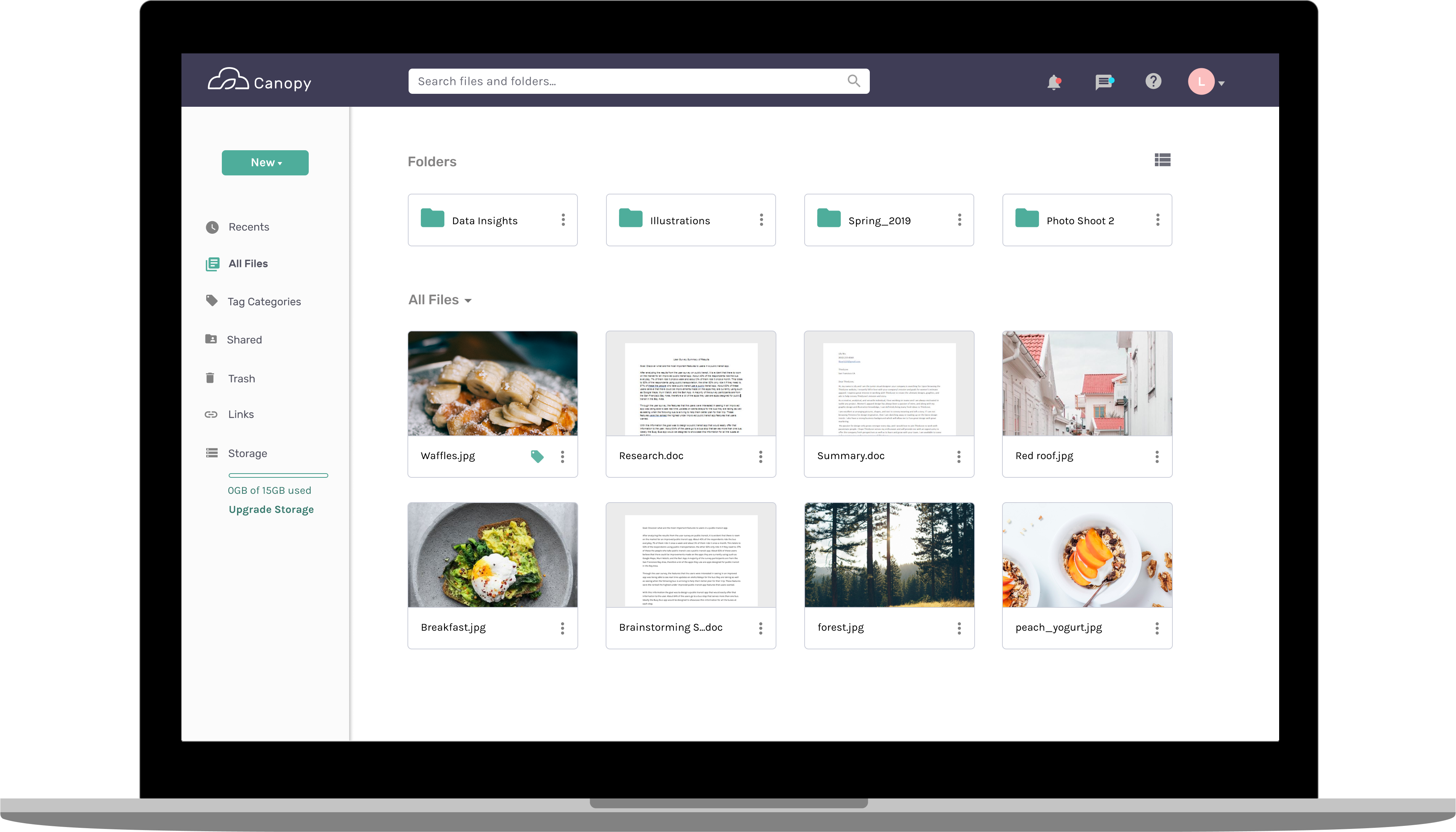
05 Visual Design
High Fidelity Mock Ups
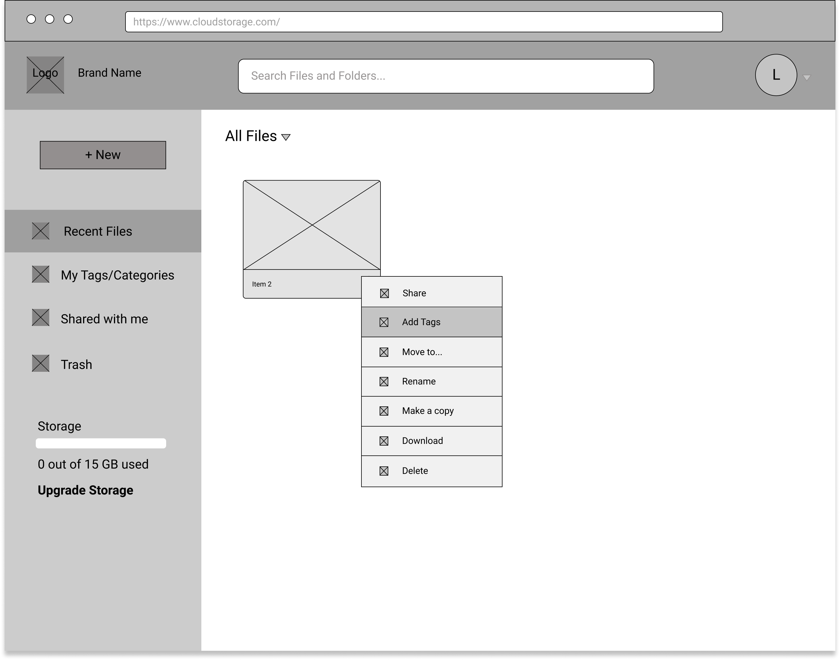
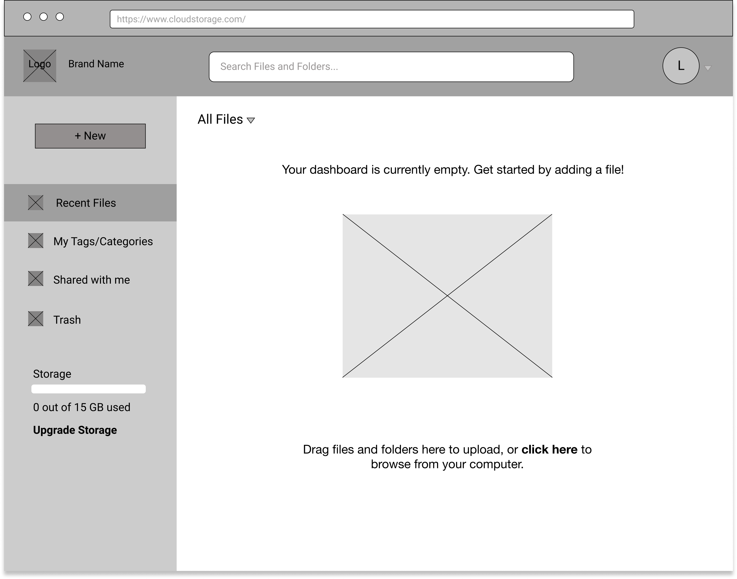
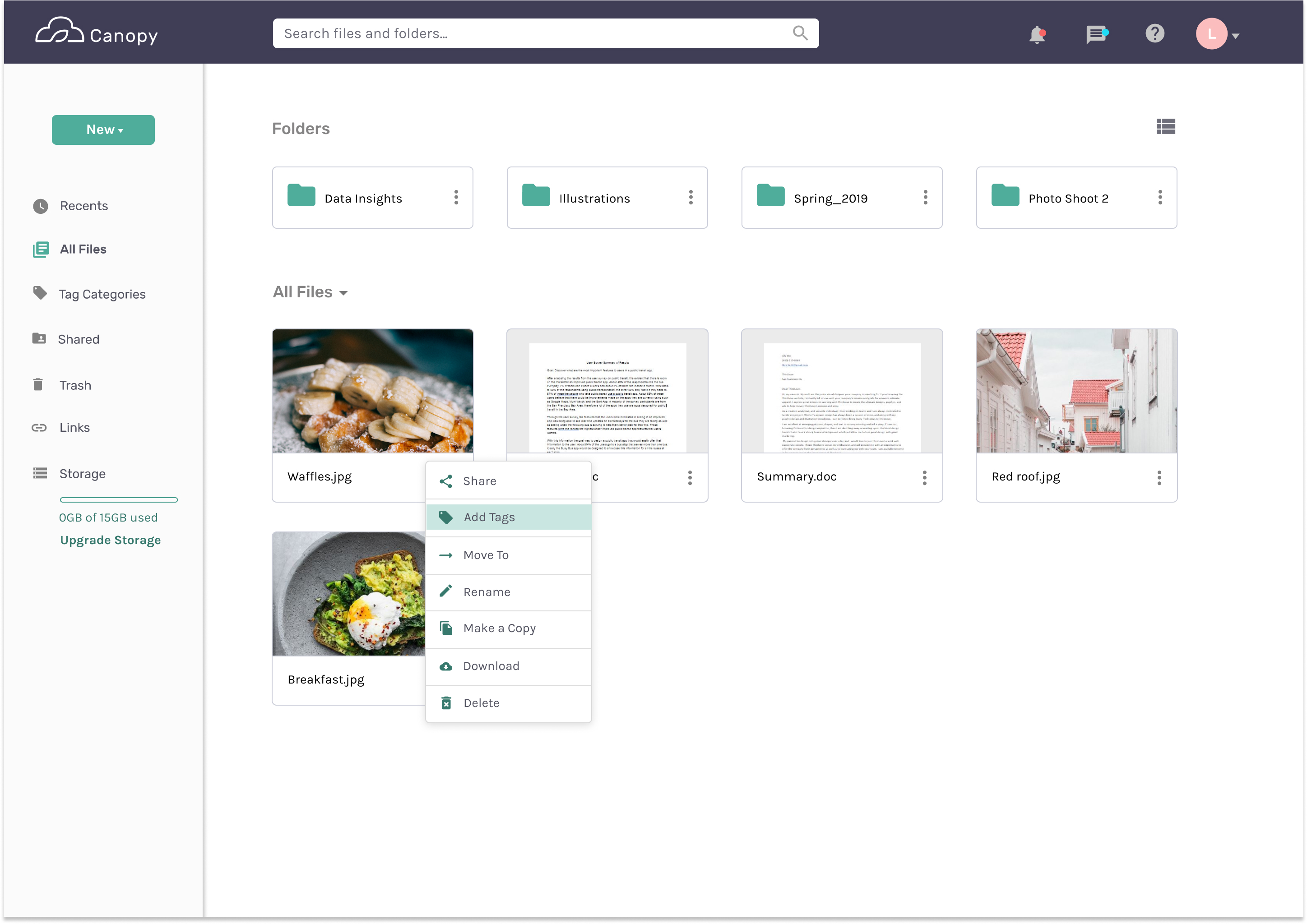
With wireframes in place and a defined brand identity, I went on to develop the high fidelity mockups of Canopy along with a clickable prototype for round two of user testing. This is the first iteration of the Canopy dashboard for the high fidelity mock up. I didn’t like how the folders at the top didn’t fit in well with the rest of the dashboard. Upon discussing it with my mentor, I decided it was best to change it to the second version. Overall, I think displaying the folders as simple smaller cards decluttered the dashboard to provide a more organized look, which is ideal.
Before
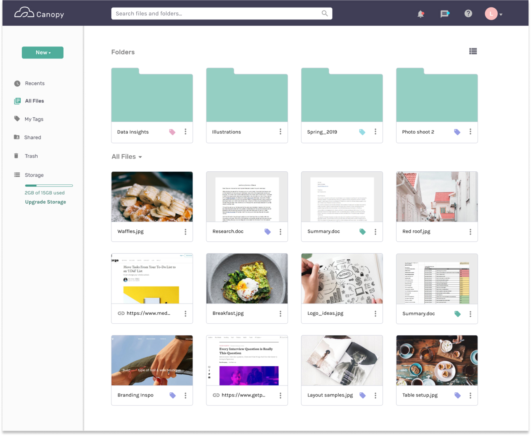
The big green folders were turned into smaller cards to declutter the dashboard.
After
Preference Testing
To finalize my high fidelity mock ups so they will be ready for round two user testing, I ran some preference tests on certain elements. The feedback I received was very helpful to complete the visual design portion. Here are the results:
70% of respondents chose the down arrow as it is more clear in showing a dropdown menu will occur once clicked on.
Before

After

89% of respondents said the link icon is more discernable when depicted next to the URL.
Before
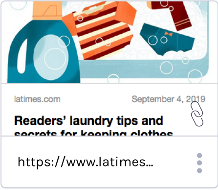
After
67% of respondents chose “success state 2” over “success state 1” The bright green state is more apparent in showing a task was successfully completed.
Before
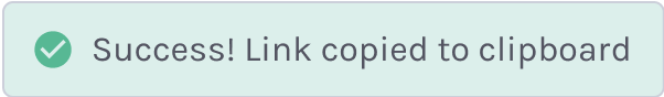
After

With preference testing completed, I made the final changes to the high fidelity mock ups and finalized the clickable prototype for round two of user testing.
Usability Testing Round 2
For round 2 user testing, users were tested in person or via Zoom with the test script on the following tasks:
1) Sign up for a basic account
2) Upload file(s)
3) Add a tag to a file to organize it
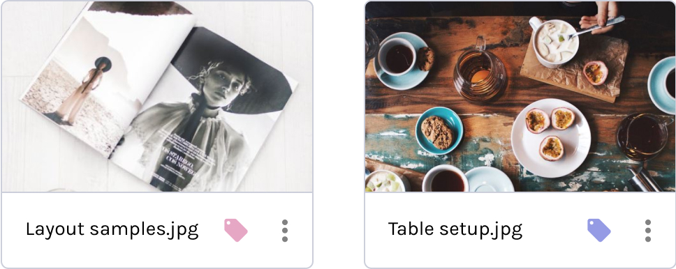
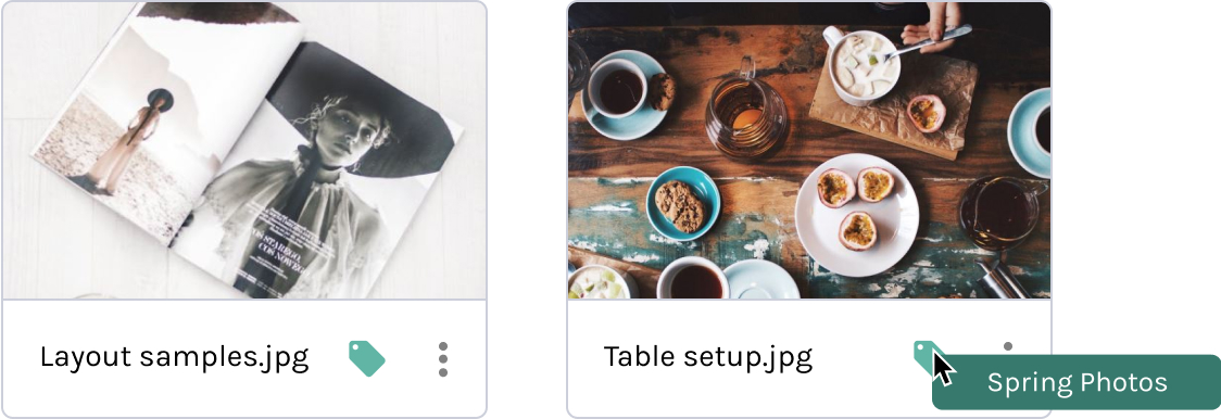
Changes: Users were confused by the different color tags. Therefore, tags were changed to one color for consistency to lessen confusion. If the user hovers over a tag, they can see the tag’s name.
Before (multi-color tags)
After (single color tags with hover)
Overall, users were able to accomplish the tasks defined. With the final changes made, the clickable prototype was finalized. Below is the design progression along with the final product.
06 Conclusion
Design Progression
Moving Forward
Two key learnings I can take away from this project is:
1) creating a better user survey and research process
2) being smarter about designing if Figma and learning how to use components.
I realized my user survey and the questions I was asking could have been stronger and less vague. As for working in Figma, I neglected to use components which I now realize would have been such a time saver. I also hope for my next project I can conduct a more indepth user testing that would allow me to test for more flows rather than just the few I tested for in this project. I really enjoyed working on this project and I am definitely looking forward to the next.
Thank you for stopping by!
